Tuesday, August 31, 2010
August Creative experiments from Daisy Yellow
After getting completely derailed by holidays, end of the school year and more holidays, I'm trying to get back on track with Tammy's August creative experiments, which she posts monthly at Daisy Yellow. It's not that I've been doing absolutely nothing creative in the interim, but what I love about her prompts is that they encourage me to move out of my comfort zone and try things it would never occur to me to do otherwise. For the summer, she's pared the list down from 12 to 6 items.
I'm sure nobody want so read my 8 minutes of stream-of-consciousness, nor my made-up story about the groceries of the person in front of me, but I can show these:
the month in 9 photographs:
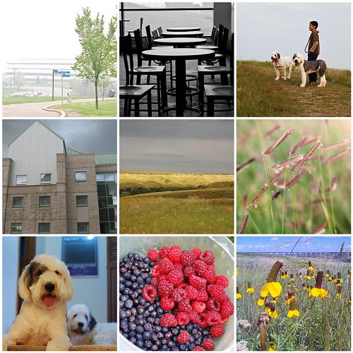
somewhat annoyingly, this is in reverse chronological order and I couldn't persuade Flickrtoys to rearrange them, but otherwise, it's about the rainiest, coolest August I can remember here in southern Alberta, leading to green coulees all the way in August, prolific berries in the garden, and flowers that should have bloomed and withered a month ago. Ironically, to the west of us, BC is having hot, dry, forest fire weather, and blowing smoke 1000 kilometres east. I'm enjoying the quiet of the university campus before the students arrive in the fall, and a visit to a campus the next province over, with its residence towers shaped like grain elevators. But perhaps most importantly, we adopted a second dog, finding that two dogs isn't twice as much fun, it's more like fun squared, possibly even fun cubed.
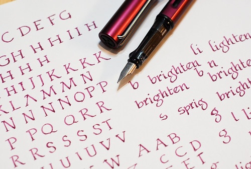
I like working on lettering, but I often forget about doing it. I especially love Edward Gorey's macabre, scratchy hand. But on this day I wanted to work on classic Roman capitals, which are deceptively simple, and harder than it looks to get pleasing proportions. Unlike italic, the thick and thin parts of the line happen in unexpected places. I suppose if you were working with a hammer and chisel you'd have plenty of leeway in how you placed your thick-and-thins. Though I did this lettering back in August, I didn't take this picture of update this post till September - thus this isn't the actual pen I used; I actually used a Pelikan 400 fitted with a 0.7mm italic nib. But that's been emptied and put away since. Standing in is the Lamy italic, not exactly a body double, but there for scale.
We hardly ever have a full deck of cards around the house, but last week we happened to have one, just by virtue of this free deck we got from having volunteered at the casino a few weekends ago (the province deems that a portion of gambling profits goes to non-profits, charities, and clubs - so each club takes a turn doing volunteer work - bizarre I know). We played hearts - I'm always struck at how elegant and medieval the face cards look, in contrast to the sheer cheeziness of the artwork in the back.

Tammy also asked us to think about this quote by Robert Bresson, "Make visible what, without you, might never have been seen." could apply this to our lives? I did think about it - but I'm not sure I have an answer yet :) I did some original research, and am going to make a poster to present some of the results at a conference. I don't think that's really what she means, though.
I'm sure nobody want so read my 8 minutes of stream-of-consciousness, nor my made-up story about the groceries of the person in front of me, but I can show these:
the month in 9 photographs:
somewhat annoyingly, this is in reverse chronological order and I couldn't persuade Flickrtoys to rearrange them, but otherwise, it's about the rainiest, coolest August I can remember here in southern Alberta, leading to green coulees all the way in August, prolific berries in the garden, and flowers that should have bloomed and withered a month ago. Ironically, to the west of us, BC is having hot, dry, forest fire weather, and blowing smoke 1000 kilometres east. I'm enjoying the quiet of the university campus before the students arrive in the fall, and a visit to a campus the next province over, with its residence towers shaped like grain elevators. But perhaps most importantly, we adopted a second dog, finding that two dogs isn't twice as much fun, it's more like fun squared, possibly even fun cubed.
I like working on lettering, but I often forget about doing it. I especially love Edward Gorey's macabre, scratchy hand. But on this day I wanted to work on classic Roman capitals, which are deceptively simple, and harder than it looks to get pleasing proportions. Unlike italic, the thick and thin parts of the line happen in unexpected places. I suppose if you were working with a hammer and chisel you'd have plenty of leeway in how you placed your thick-and-thins. Though I did this lettering back in August, I didn't take this picture of update this post till September - thus this isn't the actual pen I used; I actually used a Pelikan 400 fitted with a 0.7mm italic nib. But that's been emptied and put away since. Standing in is the Lamy italic, not exactly a body double, but there for scale.
We hardly ever have a full deck of cards around the house, but last week we happened to have one, just by virtue of this free deck we got from having volunteered at the casino a few weekends ago (the province deems that a portion of gambling profits goes to non-profits, charities, and clubs - so each club takes a turn doing volunteer work - bizarre I know). We played hearts - I'm always struck at how elegant and medieval the face cards look, in contrast to the sheer cheeziness of the artwork in the back.
Tammy also asked us to think about this quote by Robert Bresson, "Make visible what, without you, might never have been seen." could apply this to our lives? I did think about it - but I'm not sure I have an answer yet :) I did some original research, and am going to make a poster to present some of the results at a conference. I don't think that's really what she means, though.
Blogger - now eating gadgets
Is this happening to anyone else? All my gadgets (profile, archive, links etc) have disappeared from my sidebar, with just one (Coffeeshop) remaining. I tried replacing them yesterday, and they're gone again today.
Anyone know why? I don't see anyone else having this problem at the help forum!
Anyone know why? I don't see anyone else having this problem at the help forum!
Saturday, August 28, 2010
Flamin' angel socks
I'm sure I've mentioned before that buying yarn doesn't count if you're on holiday, and it's even more justified if you buy local, support small businesses, and that businesswoman is your sister in law. And anyway who can really resist the lure of Malabrigo? Franklin Habit has amply demonstrated that it can't be done.
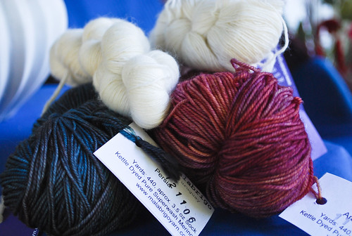
As if Malabrigo didn't already have enough stunning and seductive colours, even more have come out this fall. Of the two I got, Persia and Archangel, the Archangel is especially striking. It really seems glow. Ravelry lists this colorway as being in the purple family, and I guess it is, but I chose a skein with a greater proportion of orange, which shows up here.
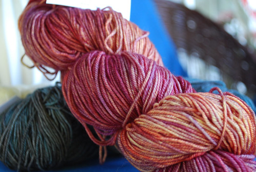
Although Malabrigo sock is soft enough to use for scarves and shawls, I use socks more than either. I'm not really in the mood for a deeply thinky, chart-following sort of pattern, so I returned to the tried-and-true Waving Lace from Interweave's Favorite Socks book. I love knitting lace without having to read the chart, so this is perfect.

Malabrigo Sock is very soft and springy and to be perfectly honest, I am not sure how well it would hold up thrust ruthlessly into boots and walked on throughout the winter. I admit I still have not worn the Embossed leaves socks I knit last summer for this very reason. But winters are cold in Alberta, and I think I will maybe use these as bed socks - some warmth, plus a little ventilation for my menopausal feet :)
Tech specs:
Yarn: Malabrigo Sock in Archangel
Pattern: Waving Lace from Favorite Socks by Interweave Knits
Needle: 2.25mm Clover bamboo dpn
As if Malabrigo didn't already have enough stunning and seductive colours, even more have come out this fall. Of the two I got, Persia and Archangel, the Archangel is especially striking. It really seems glow. Ravelry lists this colorway as being in the purple family, and I guess it is, but I chose a skein with a greater proportion of orange, which shows up here.
Although Malabrigo sock is soft enough to use for scarves and shawls, I use socks more than either. I'm not really in the mood for a deeply thinky, chart-following sort of pattern, so I returned to the tried-and-true Waving Lace from Interweave's Favorite Socks book. I love knitting lace without having to read the chart, so this is perfect.
Malabrigo Sock is very soft and springy and to be perfectly honest, I am not sure how well it would hold up thrust ruthlessly into boots and walked on throughout the winter. I admit I still have not worn the Embossed leaves socks I knit last summer for this very reason. But winters are cold in Alberta, and I think I will maybe use these as bed socks - some warmth, plus a little ventilation for my menopausal feet :)
Tech specs:
Yarn: Malabrigo Sock in Archangel
Pattern: Waving Lace from Favorite Socks by Interweave Knits
Needle: 2.25mm Clover bamboo dpn
Thursday, August 26, 2010
Rhodia Webnotebook version 3: even better than before + Giveaway!
(please note: the giveaway was drawn Sept 5 and the Webbie has been sent on to the winner)
I've already shown pictures of how beautifully this third version of the Rhodia webnotebook lies flat, and the gloriously clean and fresh look of the blank pages, devoid either of lines or logos. I've now had the chance to test different pens, inks, and other pigmented items, and conclude that this newest version of the Webbie is equal to or better than its immediate predecessor, unless you really want or need lines.
I've already shown pictures of how beautifully this third version of the Rhodia webnotebook lies flat, and the gloriously clean and fresh look of the blank pages, devoid either of lines or logos. I've now had the chance to test different pens, inks, and other pigmented items, and conclude that this newest version of the Webbie is equal to or better than its immediate predecessor, unless you really want or need lines.
Because this was a blank version, I wanted to test it for potential as an illustrated journal, and see what kind of media would work well in it. Given what we've seen from previous reviews, it works beautifully with fountain pen ink, providing crisp lines with no hint of feathering or bleedthrough. I couldn't resist adding my own logo to the bottom corner with a pigment marker, though.
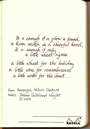
verse from a translation by Diana Gilliland Wright, who blogs at the fascinating Surprised by Time - I am not sufficiently erudite to have known this verse on my own!
I'm less enamored of its use with colored pencil, however. I really like using watersoluble pencil, usually Derwent Inktense or some such, and the smooth crisp quality of the Webbie paper that makes it so wonderful for pen and ink makes it difficult to lay down layers of pencil.

More fountain pen ink, this time Iroshizuku Kon-Peki. Even tracing lines over a few times resulted in no bleeding. Sakura gelly rolls for color went on smoothly and beautifully.
Pencil for line drawing goes much better than colored pencil, and actually works very well. As long as you don't have to do a lot of shading or any other technique where you want a toothy paper to hold the graphite, all is well. The only problem I had is that it was somewhat difficult to erase unwanted lines.
Pigment pen ink (Sakura micron in this case) dries very quickly and you can put a watercolor wash on it fairly soon after the drawing.
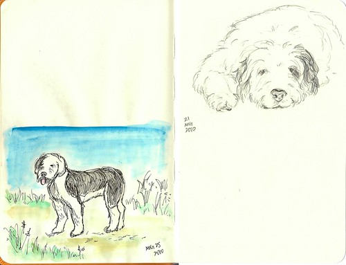
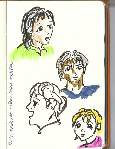
Here are my two dogs - I do plan to enter text in here, thus all the white space. If I hadn't placed a sheet of paper under the right page, the faux manga drawings on the next page would have shown through. Despite being 90 g paper, there is still the possibility of some showthrough - the paper has a certain translucency to it. This is by no means an issue, just something I was a little surprised to see given the paper weight.
Pentel pocket brush pen, with Faber Castell brush pens for color. Again, everything goes down smoothly and easily. This paper is absolutely made for almost any kind of pen and ink.
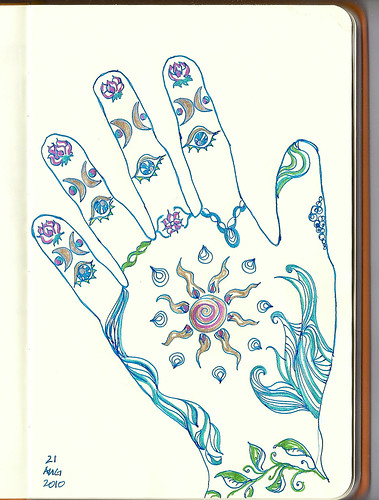
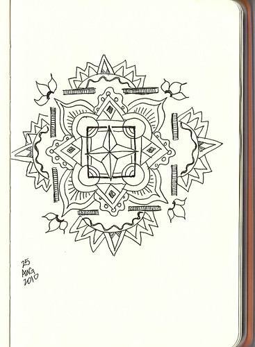
Mandala in Sakura micron pigment pen - I haven't decided whether to colour this or not - I kind of like the starkness against the creamy ivory paper.
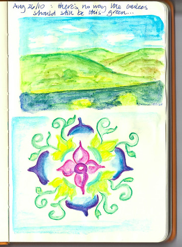
Neocolor ll crayons. I love these for their bright colors, which don't really resemble anything in nature but are a whole lot of fun, and easier to use on this particular paper than colored pencil.
I gave pencils another try. I did not really enjoy this. It seemed to be a lot of trouble getting layers of colour on, and I felt I had to press really hard, which embossed the page - and the next - more than I really liked.

But all in all - unless you really, really want to use colored pencil - this would be a great notebook to use as an illustrated journal, or any kind of journal or project book. The pocket in the back is perfect for collecting ephemera or reference pictures or anything you might want to paste into the pages (fortunes from cookies? ticket stubs?) and the paper works beautifully with all sorts of pen, ink, and light watercolor washes - you wouldn't expect to do true watercolor techniques on this type of paper, but you can certainly add a splash of colour.
And now - if you've made it this far, thank you! as previously mentioned, I have a shrinkwrapped, brand new version 3 webbie to give away. Just leave a comment telling me why you would like one, and a random winner will be drawn an announced on Labour Day, Sept 6. I'll give you a week to get back to me with your snail address, and if I don't hear from you, I'll assume you've changed your mind and I'll draw another winner. Good luck!
also, if you've reviewed this v3 Webbie too, please let me know so I can add a link to your post. So far, the only one I know about for sure are Julie and Heather's - but I know there are more!
Other reviews:
Whatever - Julie/Okami
A Penchant for Paper - Heather
verse from a translation by Diana Gilliland Wright, who blogs at the fascinating Surprised by Time - I am not sufficiently erudite to have known this verse on my own!
I'm less enamored of its use with colored pencil, however. I really like using watersoluble pencil, usually Derwent Inktense or some such, and the smooth crisp quality of the Webbie paper that makes it so wonderful for pen and ink makes it difficult to lay down layers of pencil.
More fountain pen ink, this time Iroshizuku Kon-Peki. Even tracing lines over a few times resulted in no bleeding. Sakura gelly rolls for color went on smoothly and beautifully.
Pencil for line drawing goes much better than colored pencil, and actually works very well. As long as you don't have to do a lot of shading or any other technique where you want a toothy paper to hold the graphite, all is well. The only problem I had is that it was somewhat difficult to erase unwanted lines.
Pigment pen ink (Sakura micron in this case) dries very quickly and you can put a watercolor wash on it fairly soon after the drawing.
Here are my two dogs - I do plan to enter text in here, thus all the white space. If I hadn't placed a sheet of paper under the right page, the faux manga drawings on the next page would have shown through. Despite being 90 g paper, there is still the possibility of some showthrough - the paper has a certain translucency to it. This is by no means an issue, just something I was a little surprised to see given the paper weight.
Pentel pocket brush pen, with Faber Castell brush pens for color. Again, everything goes down smoothly and easily. This paper is absolutely made for almost any kind of pen and ink.
Mandala in Sakura micron pigment pen - I haven't decided whether to colour this or not - I kind of like the starkness against the creamy ivory paper.
Neocolor ll crayons. I love these for their bright colors, which don't really resemble anything in nature but are a whole lot of fun, and easier to use on this particular paper than colored pencil.
I gave pencils another try. I did not really enjoy this. It seemed to be a lot of trouble getting layers of colour on, and I felt I had to press really hard, which embossed the page - and the next - more than I really liked.
But all in all - unless you really, really want to use colored pencil - this would be a great notebook to use as an illustrated journal, or any kind of journal or project book. The pocket in the back is perfect for collecting ephemera or reference pictures or anything you might want to paste into the pages (fortunes from cookies? ticket stubs?) and the paper works beautifully with all sorts of pen, ink, and light watercolor washes - you wouldn't expect to do true watercolor techniques on this type of paper, but you can certainly add a splash of colour.
And now - if you've made it this far, thank you! as previously mentioned, I have a shrinkwrapped, brand new version 3 webbie to give away. Just leave a comment telling me why you would like one, and a random winner will be drawn an announced on Labour Day, Sept 6. I'll give you a week to get back to me with your snail address, and if I don't hear from you, I'll assume you've changed your mind and I'll draw another winner. Good luck!
also, if you've reviewed this v3 Webbie too, please let me know so I can add a link to your post. So far, the only one I know about for sure are Julie and Heather's - but I know there are more!
Other reviews:
Whatever - Julie/Okami
A Penchant for Paper - Heather
Sunday, August 22, 2010
teaser
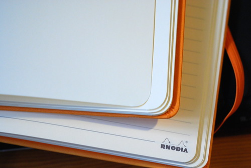
behold! the noticeably blank corner3 of the Rhodia Webnotebook, courtesy of Stephanie(Biffybeans) of Rhodia Drive and Karen Doherty of Exaclair.
I'm in the process of trying it out and reviewing it now, but here it is not only in an unlined version (yay!!) but with the corner logo gone. That never bothered me, but apparently it made other people nuts.
And it lies flat - much flatter than version 2:

A couple of reviews are out already, and as expected the paper continues to be excellent for fountain pen ink, just like the version 2 reviewed earlier. However, because this is a blank version, I want to experiment a bit with pencils and color, to see how it might work as an illustrated journal. I should be done in a week or two, and I'll also have a second, spanking new, shrink-wrapped Webbie to give away. More soon!
I'm in the process of trying it out and reviewing it now, but here it is not only in an unlined version (yay!!) but with the corner logo gone. That never bothered me, but apparently it made other people nuts.
And it lies flat - much flatter than version 2:
A couple of reviews are out already, and as expected the paper continues to be excellent for fountain pen ink, just like the version 2 reviewed earlier. However, because this is a blank version, I want to experiment a bit with pencils and color, to see how it might work as an illustrated journal. I should be done in a week or two, and I'll also have a second, spanking new, shrink-wrapped Webbie to give away. More soon!
Light on the prairie
Just playing with Shakeit again, and wondering if there's any truth to the native saying that two or more seed heads on a stalk of blue grama mean a hard winter ahead.


Friday, August 20, 2010
this is what poor air quality looks like

the smoke from the BC wildfires are hanging over Lethbridge today, with an air quality of 122, or very poor. Admittedly, it looks just like fog or mist. But it smells like the remains of last night's campfire.
I hate thinking of what's happening in some of the most beautiful parts of my home province. When we drove across BC to Alberta last month, haze covered the skies throughout the entire interior, and you couldn't help noticing how brown the hills around Kamloops were, and how the formerly green stands of trees were red-brown from pine beetle - or else, just dead. Hoping for safety for the residents, and recovery from one of the most devastating fire seasons the province has yet seen.
How beautiful are these areas being devastated? Here's an old picture, for instance, of Chilko Lake. It's unlikely that it still looks like this right now.
How beautiful are these areas being devastated? Here's an old picture, for instance, of Chilko Lake. It's unlikely that it still looks like this right now.

Wednesday, August 11, 2010
today's domestic lesson
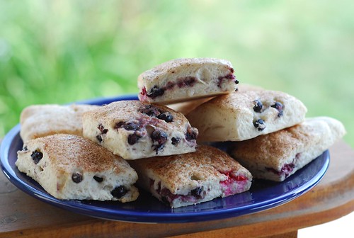
If you find an old package of biscuit mix in the cupboard, do not say "yay!"
Say "I don't remember when we bought this stuff" and do not proceed to ruin perfectly good saskatoons by making stale-tasting biscuits with them. I'm sorry, saskatoons.
Say "I don't remember when we bought this stuff" and do not proceed to ruin perfectly good saskatoons by making stale-tasting biscuits with them. I'm sorry, saskatoons.
Monday, August 09, 2010
saskatoons and raspberries
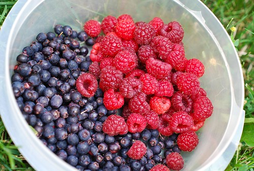
I was complaining to Liz, a fellow Flickr-er who lives in my area, that we almost never get any saskatoons and what little the bushes produce, the birds eat. This is the first year I have ever seen them in any abundance - I think partly due to the rain, partly due to a large hawk that has taken up residence in our green strip. I haven't seen the usual numbers of small birds that are resident here, normally clustering around our feeder, then moving on to the bushes.
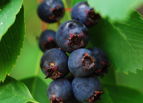
Saskatoons are quite small at the best of times, but they're larger than usual this year, and actually look kind of juicy.
Saskatoons are quite small at the best of times, but they're larger than usual this year, and actually look kind of juicy.
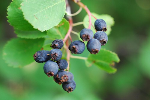
Because we're not used to looking for berries on this bush, there are quite a few that have started to dry out before we even noticed they were there. This is the beauty of these berries, for wildlife anyway - they dry out right on the bush, and stay there - they don't fall off and rot. So they're available for birds through the winter (assuming they haven't been consumed yet) and I imagine this must also have been useful for the First Nations people in this area as well.
They're small and a bit fussy to pick, and I'm not really planning on doing a lot with them - some people make jam, syrup or wine - but they're nice to snack on. Maybe they need to sit on a dollop of whipped cream, though.
Subscribe to:
Posts (Atom)
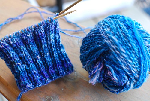
It feels like I've been working on this for a very long time, and in fact I started spinning it way back the summer before last. I have two reasonably sized hanks of 2 ply, which I have very scientifically estimated to be close to sufficient because when I squish them in my hand they feel about the same size as a sock.
I'm still spinning this stuff, but not because I think I'll actually need it - it's just very portable and easy to pick up and spin a bit at a time, and I love watching the colours change as I spin - almost hypnotic.