I'm sure nobody want so read my 8 minutes of stream-of-consciousness, nor my made-up story about the groceries of the person in front of me, but I can show these:
the month in 9 photographs:
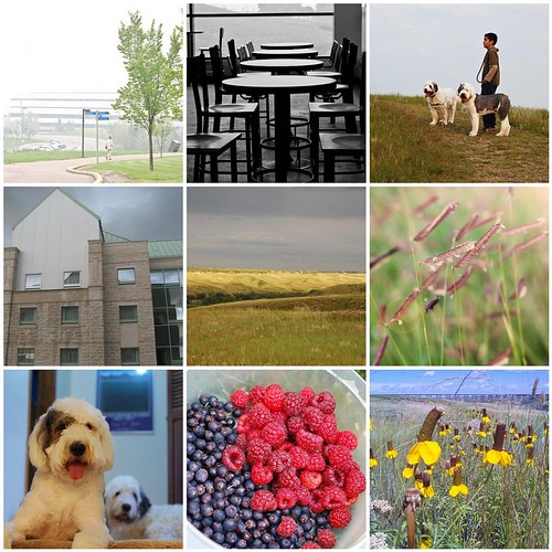
somewhat annoyingly, this is in reverse chronological order and I couldn't persuade Flickrtoys to rearrange them, but otherwise, it's about the rainiest, coolest August I can remember here in southern Alberta, leading to green coulees all the way in August, prolific berries in the garden, and flowers that should have bloomed and withered a month ago. Ironically, to the west of us, BC is having hot, dry, forest fire weather, and blowing smoke 1000 kilometres east. I'm enjoying the quiet of the university campus before the students arrive in the fall, and a visit to a campus the next province over, with its residence towers shaped like grain elevators. But perhaps most importantly, we adopted a second dog, finding that two dogs isn't twice as much fun, it's more like fun squared, possibly even fun cubed.
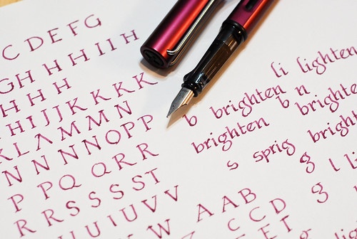
I like working on lettering, but I often forget about doing it. I especially love Edward Gorey's macabre, scratchy hand. But on this day I wanted to work on classic Roman capitals, which are deceptively simple, and harder than it looks to get pleasing proportions. Unlike italic, the thick and thin parts of the line happen in unexpected places. I suppose if you were working with a hammer and chisel you'd have plenty of leeway in how you placed your thick-and-thins. Though I did this lettering back in August, I didn't take this picture of update this post till September - thus this isn't the actual pen I used; I actually used a Pelikan 400 fitted with a 0.7mm italic nib. But that's been emptied and put away since. Standing in is the Lamy italic, not exactly a body double, but there for scale.
We hardly ever have a full deck of cards around the house, but last week we happened to have one, just by virtue of this free deck we got from having volunteered at the casino a few weekends ago (the province deems that a portion of gambling profits goes to non-profits, charities, and clubs - so each club takes a turn doing volunteer work - bizarre I know). We played hearts - I'm always struck at how elegant and medieval the face cards look, in contrast to the sheer cheeziness of the artwork in the back.

Tammy also asked us to think about this quote by Robert Bresson, "Make visible what, without you, might never have been seen." could apply this to our lives? I did think about it - but I'm not sure I have an answer yet :) I did some original research, and am going to make a poster to present some of the results at a conference. I don't think that's really what she means, though.
No comments:
Post a Comment