As I wrote at the FPN forum :
"the paper in my Habana does not have the silky feel that I expected from a Clairefontaine product... It feels nothing like Rhodia, Clairefontaine, or the Quo Vadis planners I've owned in the past. It feels toothy running your hand over it...Writing on this paper made my pen feel scratchy - in fact, I had to keep some Rhodia notepaper nearby to write on intermittently to assure myself that the tines didn't suddenly spring out of alignment or catch a fibre. There isn't any doubt that it was the paper causing the scratchy feeling."
That post produced some discussion at the Quo Vadis blog, and it appeared that notebooks sold in Canada and Europe were different from the ones in the US, a situation that is still true: the difference between the Canadian market Habana and US market Habana is apparant in more ways than one - though not till you open up the book.
The outer appearance is the same: hard cover padded with softer vinyl, similar to the Webnotebook . In both versions, the logo is imprinted in the bottom right hand corner.
(all pictures are clickable to larger versions)
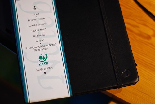
Both of these are the large size, approximately 6" x 9", so larger than either the large Moleskine or Webnotebook. Note that the the Canadian version with the brown/orange label contains 224 pages, in contrast to the US version with 80 sheets/160 pages. Implicit here is the difference in paper weight: in a notebook of identical size, the Canadian version necessarily contains lighter weight paper - 60 g according to the thread referenced earlier.
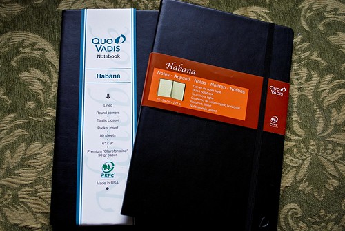
(Canadian version on the right, with orange and brown label)
The Canadian version has cream colored paper, which I personally really like and a narrower ruling, which I don't love, but don't mind, either. In contrast, the US version has bright white Clairefontaine paper, with wider ruling.
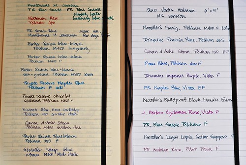
(Canadian version in cream on the left, US version in white on the right)
Actually, on the front page, both notebooks seem to perform well. There's no feathering from any of the inks in the Canadian version. The lighter weight is really apparant, though, as you can easily see the writing showing through from the next page. That might not, in itself, bother me. If it weren't for this:
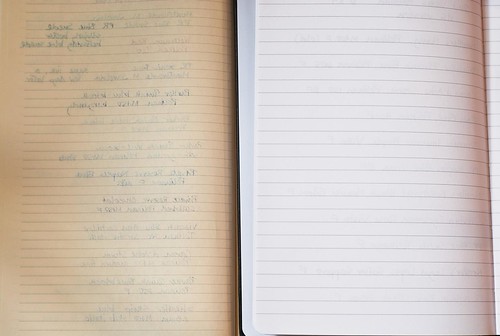
(Canadian version in cream on the left, US version in white on the right)
Quite a bit more bleeding through that I really would like. In comparison, there is no bleedthrough, and minimal showthrough in the heavier, glossier paper used in the US version. The paper feels just as you'd expect Clairefontaine paper to feel - strong, smooth, and perfect for fountain pen ink. I've used Clairefontaine clothbound notebooks for some time, and it's great to have this paper bound in a hardcover with elastic and pocket.
Like the Webnotebook, the US version of the Habana is superior to the Canadian/EU version in many ways, although personal preference might come into play. Some people dislike the bright white colour and the wide ruling, although that would not personally be a deterrent for me. It could also be argued that with less pages, 160 vs. 224, it might be less of a bargain - but the trade-off is paper weight: if you end up only writing on one side of the lighter, 60 g pages due to bleeding or showthrough, all those extra pages aren't much of an advantage.
Bottom line:
I like the US version of the Habana a good deal better than the Canadian one, and would again find it more usable. However, I don't like it better than the Webnotebook, which would be my preference because of the smaller size, cream colored pages, and slightly narrower ruling. Because of the wider ruling, I would be less likely to use the Habana as my personal journal, and more likely to use it as a project journal where I want ideas laid and spaced out more clearly (I like my personal stuff to look cramped and cryptic :) - like my thoughts)
The Habana would be a great choice for anyone who likes Clairefontaine paper, which has always been consistent for me in performance and texture. It has a utilitarian, no-nonsense look and the slim build and durable binding would make it ideal for carrying around day-to day. However, for the reasons given above my first choice would still be the Webnotebook.
No comments:
Post a Comment