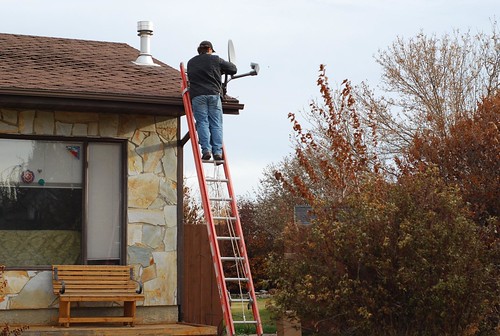
we have joined the 20th century - or, wait, is it the 21st? Vexed at last with crappy cable choices, Tim broke down and ordered satellite TV. I hardly watch TV at all, not because I am philosophically opposed to it or virtuous in any way, I just can't find anything I want to watch. This feels very decadent to me - my family didn't have cable TV growing up; we had two and a half channels (four on a really good day and the wind blowing in the right direction) and Tim didn't even have *live* TV when he was young - they had to truck in tapes to Prince Rupert so that the hockey games were a week late by the time you watched them. So we are quite agog at the possibilities.
Of most relevance to me: I get more knitting done if I have something to watch on TV. With the coming need to wear more wool (and children having outgrown mittens, etc), this is good timing. That is, if someone else operates the blasted remote control for me so I can keep my hands on the needles.
Wednesday, October 28, 2009
out of the stone age
Monday, October 26, 2009
momentary loss of motivation
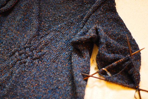
Two thirds of a gathered yoke pullover, the sweater I started way back in January. I lost momentum when it got warm in the spring, but the reason I'm having a hard time picking it back up is that it is a very unweildy project. I thought I'd be clever and knit the sleeves from the shoulder down so as to avoid seaming. This is great in theory, but very annoying to have this big clump of sweater in your lap while knitting a relatively smallish tube. Still, I have vowed to finish this thing before starting a new project, and I desperately want to start a new project. Also, it is very cold here.
Sunday, October 25, 2009
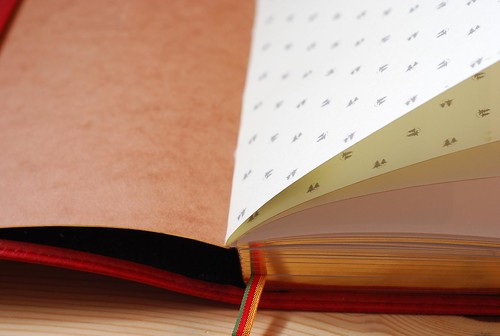
Exacompta Basics Sketchbook Review - Part 3 of the Exaclair Swag Fest
As beautiful as all the notebooks were, this was easily the most striking and most pleasant to hold in the hand, owing to the leather-like Madeira cover. Usually fake leather feels really cheezy, but not this. It's warm and flexible to the touch, and lightly embossed with a faux grain and stitching.
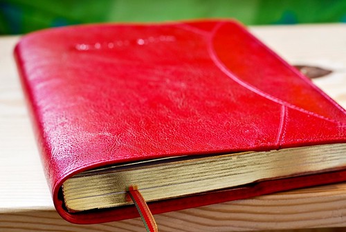
The book itself is clothbound with a cardboard cover, very much like the Clairefontaine "Age Bag" notebooks I've used over the years. In fact, other than the imprinted logo and slightly narrower format, you could easily mistake the two - except for the multicoloured ribbon marker, gold edging, and most importantly, the paper.
Rather than the smooth white 90 g paper you'd normally find in a Clairefontaine notebook, the Exacompta sketchbook contains a 100g light cream laid paper. This is produced in the same plant that makes G. Lalo stationery, thus the paper is lightly textured, one side more markedly than the other. Both sides are highly compatible with fountain pen inks.
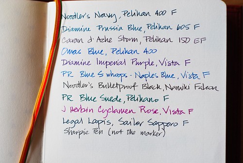
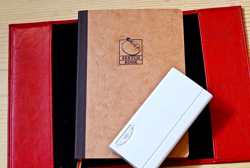
However, it is a sketchbook - so I pulled out several pencils and pens to see how the paper behaved. Caveat: I am not an artist. I am someone who scribbles on notepaper during lectures and napkins while waiting for a meal, and I use sketchbooks as a rationale for buying colorful pencils and many pens. That disclosure aside, here are some charts with various media. All pictures are clickable to larger pictures at Flickr.
I tried:
0.35 Rapidosketch with India Ink
superfine Pitt Artist Pen in black and sepia
0.3 mm Pilot drawing pen
0.5 mm Sakura Pigment Micron
Pentel pocket Brush pen for calligraphy
Neocolor II watersoluble crayons
Derwent Inktense watersoluble pencils
Derwent Graphitint pencils
Winsor & Newton watercolours (I think).
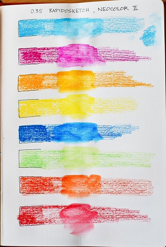

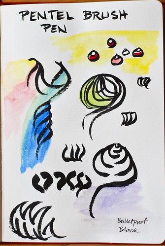
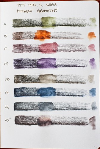

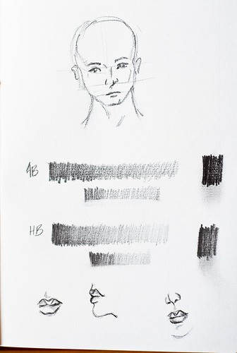
Since the pictures are pretty clearly labelled, I'm not going to give a blow-by-blow of every single one, just summarize to say that colours stay beautifully bright and clean, with a minimal of buckling when wet. It's easy to pick up colour from one area and transfer it to another. The slightly muddy looking colours in the brush pen page is more an issue of having not cleaned my paint box recently, and nothing to do with the paper.
All pen inks went down smoothly with clean, sharp, lines, and none bled through or feathered. The only potential drawback is that due to the slight texture of the laid paper, I don't think I would use a pen much narrower than the .35 mm Rapidosketch - that is probably the smallest size I would feel comfortable with on this paper.
The paper is ideal for pencil, as well. I tried a 4B and HB Staedtler lumograph and the slight tooth was perfect for pencil use. The only potential drawback is that the texture makes it somewhat difficult to erase cleanly, but that occurs with many other papers and not a major drawback to the overall quality of the paper.
The laid texture does show up more prominently on one side than the other, which means that depending on where you are in the signature, you will have either the smoother or laid side facing you. It may or may not matter to you, but you certainly have the ability to choose which side to work on if you wish. The centre of the signature, however, will only show you the smoother side if you wanted to do a double page spread.
All in all, this is a book that I really enjoyed testing and continue to enjoy using. If I were the sort of girl to hug a book to my chest and spin around in delight, this is the book that would make me do that. However, I'm not, so instead, I just stuff it in my bag and carry it around and shout "don't touch that" whenever a member of my family ventures near it.
I have plenty of sketchbooks, all of which I use at some point or another, but among the virtues of this one is that it lies flat WITHOUT hateful spirals that drive me nuts, or the annoying hump in the middle that some notebooks have. I thought at first that the gold edging and ribbon marker, not to mention the vibrant Madeira cover would make it seem too "nice" for everyday use, but that hasn't been the case at all. It's just the right size to carry around, the right balance between flexibility and stiffness, and the paper seems happy to take anything you care to throw at it. I've already ordered a few for my children, one of the rare times that I actually order something from out of the country. I like it that much.
Read more reviews on this sketchbook at:
Dizzy Pen
Lung Sketching Scrolls
Spiritual Evolution of the Bean
The Inkophile
Many thanks again to Karen of Exaclair for the chance to try these wonderful products!
#491; In which Wendy is prepared
#491; In which Wendy is prepared
Friday, October 23, 2009
to while the cold winter away
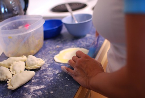
Saturday morning is usually judo practice, but only one out of the three of us felt really up to it, so the other two of us picked up wonton skins with the idea of making chicken soup - wonton chicken soup, that is.
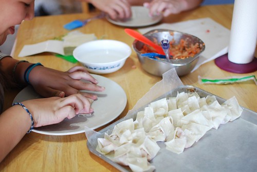
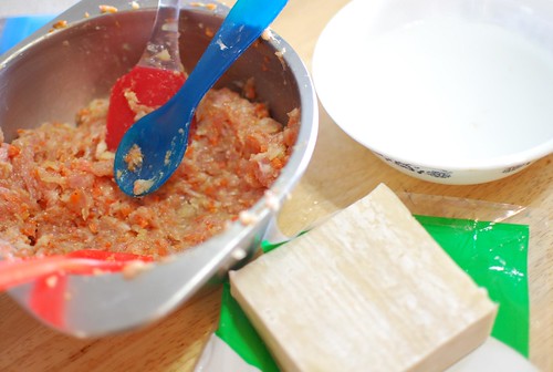
we ground up chicken thighs, added chopped carrot and onion, and seasoned it with black pepper, salt, soy sauce, and some ground ginger. Next time I think we will add green onions and water chestnuts. I was pretty happy with these, considering that I haven't made them since I lived at home with my parents. Dropped into homemade turkey broth from the freezer and simmered till tender, they were fabulous, and I'm sure, very therapeutic.
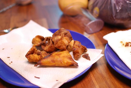
I hate deep frying things because I can never get the oil the right temperature and I inevitably burn things. Plus the house smells like McDonalds for a few days. Ecch. Yet I felt compelled to try it anyway, just this once, because hey, wontons.
They were not a succcess. The skins burned, and the filling did not quite cook through, necessitating putting them in the microwave, which of course toughened the skins. Ugh.
In the same batch, threw in some samosas made with a curried beef filling. However, the samosa pastry I bought at the local ethnic food store kept falling apart - probably freezer burned and a bit brittle. No matter how much I tried to soften it with a damp paper towel, etc. it cracked even when gently rolled.
so I made some empanada dough to enclose it instead.
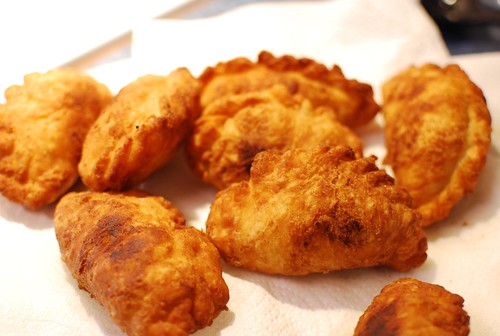
We baked most of them, but for the sake of experimentation, tried frying a few.
The filling turned out better than usual - I think because of the addition of toasted cumin seeds.
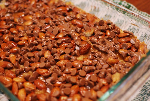
Almond toffee bars. Stasha made these. I'd forgetten how good roasted almonds are, and that's just what happens to these almonds here, after baking in the oven surrounded by butter and sugar...
They are horribly addictive. She has been ordered to never ever make them again, except maybe at Christmas.
I was inspired by mikomiao's picture and post at Flickr to roast eggplants and make baba ganoush, using Pioneer Woman's graphic and very funny recipe. It would have been a lot better if I'd realized that the 4 garlic cloves the recipe called for was meant for three eggplants, not the two I actually used. Whoops.
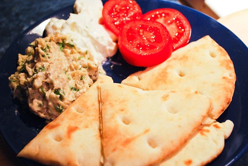
It is still worth another try, either with more eggplant and less garlic, and maybe a less heavy hand with the tahini. But overall, a good food weekend.
Next up? Maybe some Vietnamese style salad rolls? another stab at the baba? I did enjoy scooping out their brain-like innards. And, I have a butternut squash just sitting on my kitchen island waiting for something interesting to happen. Hmmm.
Friday, October 16, 2009
telephone
Another Film Friday placeholder. After over a week of miserably grey cold weather, the chinook came and tore the clouds into fantastic shapes that changed throughout the day.
I didn't actually take the film version of this one myself - I let my daughter try out the film camera this time, but honestly she has as much of a chance as I do of getting something decent.
The film is done so I'll take it in tomorrow. I was genuinely worried I'd mess up rewinding the film and taking it out of the camera since it's been so long since I'd last done it. I hope some of them turned out, but I'm glad I have these digital versions for backup.
One more cloud picture, looking westward.
Sunday, October 11, 2009
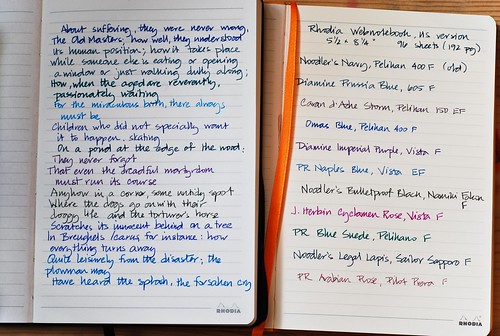
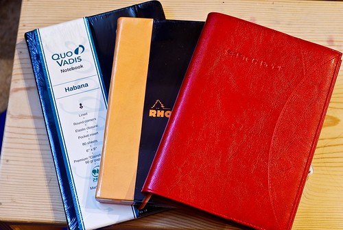
Exaclair product review, Part 2: Quo Vadis Habana review, US version
As I wrote at the FPN forum :
"the paper in my Habana does not have the silky feel that I expected from a Clairefontaine product... It feels nothing like Rhodia, Clairefontaine, or the Quo Vadis planners I've owned in the past. It feels toothy running your hand over it...Writing on this paper made my pen feel scratchy - in fact, I had to keep some Rhodia notepaper nearby to write on intermittently to assure myself that the tines didn't suddenly spring out of alignment or catch a fibre. There isn't any doubt that it was the paper causing the scratchy feeling."
That post produced some discussion at the Quo Vadis blog, and it appeared that notebooks sold in Canada and Europe were different from the ones in the US, a situation that is still true: the difference between the Canadian market Habana and US market Habana is apparant in more ways than one - though not till you open up the book.
The outer appearance is the same: hard cover padded with softer vinyl, similar to the Webnotebook . In both versions, the logo is imprinted in the bottom right hand corner.
(all pictures are clickable to larger versions)
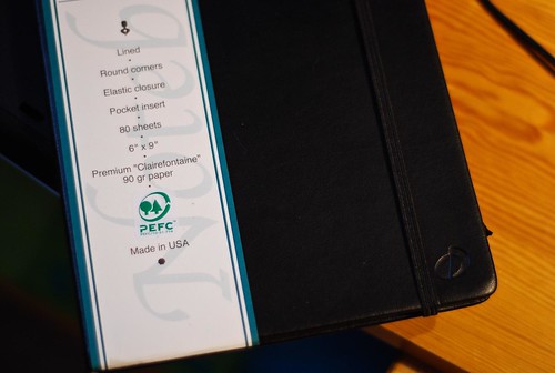
Both of these are the large size, approximately 6" x 9", so larger than either the large Moleskine or Webnotebook. Note that the the Canadian version with the brown/orange label contains 224 pages, in contrast to the US version with 80 sheets/160 pages. Implicit here is the difference in paper weight: in a notebook of identical size, the Canadian version necessarily contains lighter weight paper - 60 g according to the thread referenced earlier.
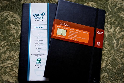
(Canadian version on the right, with orange and brown label)
The Canadian version has cream colored paper, which I personally really like and a narrower ruling, which I don't love, but don't mind, either. In contrast, the US version has bright white Clairefontaine paper, with wider ruling.
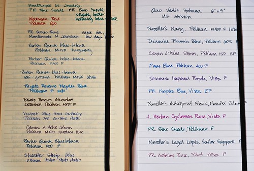
(Canadian version in cream on the left, US version in white on the right)
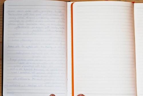
Actually, on the front page, both notebooks seem to perform well. There's no feathering from any of the inks in the Canadian version. The lighter weight is really apparant, though, as you can easily see the writing showing through from the next page. That might not, in itself, bother me. If it weren't for this:
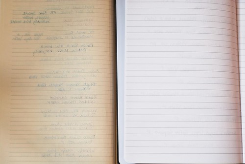
(Canadian version in cream on the left, US version in white on the right)
Quite a bit more bleeding through that I really would like. In comparison, there is no bleedthrough, and minimal showthrough in the heavier, glossier paper used in the US version. The paper feels just as you'd expect Clairefontaine paper to feel - strong, smooth, and perfect for fountain pen ink. I've used Clairefontaine clothbound notebooks for some time, and it's great to have this paper bound in a hardcover with elastic and pocket.
Like the Webnotebook, the US version of the Habana is superior to the Canadian/EU version in many ways, although personal preference might come into play. Some people dislike the bright white colour and the wide ruling, although that would not personally be a deterrent for me. It could also be argued that with less pages, 160 vs. 224, it might be less of a bargain - but the trade-off is paper weight: if you end up only writing on one side of the lighter, 60 g pages due to bleeding or showthrough, all those extra pages aren't much of an advantage.
Bottom line:
I like the US version of the Habana a good deal better than the Canadian one, and would again find it more usable. However, I don't like it better than the Webnotebook, which would be my preference because of the smaller size, cream colored pages, and slightly narrower ruling. Because of the wider ruling, I would be less likely to use the Habana as my personal journal, and more likely to use it as a project journal where I want ideas laid and spaced out more clearly (I like my personal stuff to look cramped and cryptic :) - like my thoughts)
The Habana would be a great choice for anyone who likes Clairefontaine paper, which has always been consistent for me in performance and texture. It has a utilitarian, no-nonsense look and the slim build and durable binding would make it ideal for carrying around day-to day. However, for the reasons given above my first choice would still be the Webnotebook.
Saturday, October 10, 2009
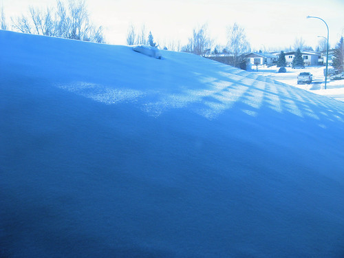
warming up, 283/365
Not literally - it's still unseasonably cold out there.
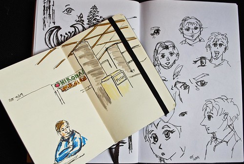
I felt slight panic when I was given the chance to review the Exacompata Basics sketchbook in Madeira cover because I'm out of practice - I haven't really drawn anything since spring and I'm feeling pretty rusty. So I pulled out some pens and markers and started warming up.
I haven't sat in the food court at school in a long time - I really don't hang out there much anymore, now that I have a lab to work in, but I went there anyway just to draw. And the kids have been practicing drawing manga, so last night we all did it together, thus the big eyes, small mouth thing going on in one of the pages. Saturday, October 10.
Friday, October 09, 2009
So it begins, 281/365

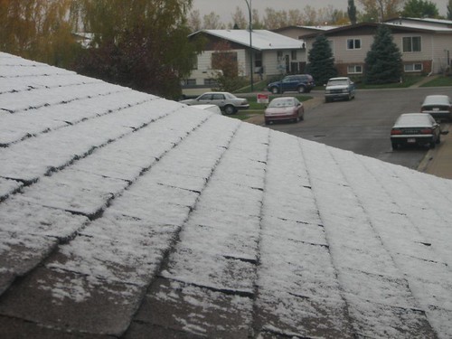
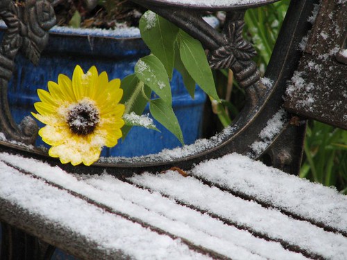
I don't mind winter, not a lot. But I'd prefer to have a little fall, first. And I'm really annoyed that I was nearly late to teach my yoga class this morning, because I wasn't expecting to come out and find my vehicle encased in ice.
I'm not sure why I'm surprised - it's not like it hasn't happened before - here's October 4, 2005
except that year, the snow only lasted a day.
Apparantly, complaining about the weather is a preoccupation of mine, as evidenced by my 365 picture, earlier this year in March.
Wednesday, October 07, 2009
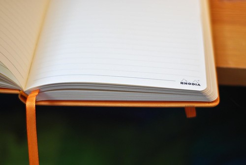
Exaclair product review, Part 1: Rhodia Webnotebook , the US version
The initial release of the Webnotebook, unfortunately, failed to meet expectations: users at Fountain Pen Network reported that the paper was quite unlike that found in the Rhodia pads and was disappointingly unsuitable for many fountain pens and inks. Exaclair , the US distributor of Rhodia, Quo Vadis, Exacompta and Clairefontaine (among others) listened to the response and moved quickly, and several months later, released an improved version of the Webnotebook, this time with the Rhodia paper everyone knew and loved. Sadly, this version was only released in the States, as I found out when I purchased a Webnotebook in my home province of Alberta - it was one of those with the inferior paper.
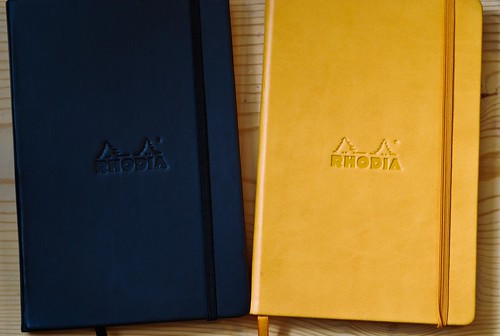
left: black Webnotebook bought in Canada. 80g paper, 192 lined pages, 14.5 x 21 cm
right: orange Webnotebook, US version from Exaclair. 90 g paper, 192 lined pages, 5"x 8"
(this picture and all the rest are clickable to larger sizes)
Stephanie of Rhodia Drive took pity on me, especially since she knew this was my second experience with a Canadian version of a product that did not perform as well as the US versions. She contacted Karen Doherty of Exaclair, who generously sent me sample copies of the Webnotebook, the Quo Vadis Habana, and the Exacompta Basics sketchbook in a Madiera cover.
My first reaction - "Only in America? Pity!" (you have to be a certain age and nationality to get that reference)
OK - that was actually my second (or third) reaction: my first reaction was "Put those down! Those are for me!" as my husband and son pounced on them: "These look great! can I have one? Can I have THIS one?"
The Webnotebook is certainly a good looking notebook, as is the Habana and Madeira sketchbook accompanying it. The version I received is just a little wider than a large Moleskine. It might be my imagination, but it also seems a tad thicker than my Canadian purchased version, which could either be because it contains 90 rather than 80 g. paper - or, it could just be because black is slimming :)
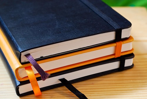
bottom to top: Canadian-purchased Webnotebook, US version Webnotebook, large Moleskine
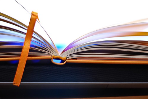
The build is very like the moleskine, with a softer vinyl cover that is slightly imprinted by the elastic band, but that's not something that would bother me. There is an accordion pocket in the back (I admit I rarely use the pocket in this size journal, but it is still nice to have). Others have commented that they don't care for the Rhodia logo stamped on the front or printed on the page corners, but again, this isn't something that would really bother me.
There's two things I really want my ideal notebook to do: Lie flat when open, and take fountain pen ink without bleeding (ink spreading through to the other side) or feathering (spidery ink veins spreading from the line).
I'm happy to say that the US version of the Rhodia webnotebook does both, for the most part. I really hate writing into the "hump" in the middle of a book - that should not be a problem here. The signatures seem sewn in a little tighter than the Moleskine, so the pages don't lie quite as flat - but they will remain open if you leave the book open. I think they will likely loosen up with use and over time.
The paper is cream colored and, happily, is as great to write on as the Rhodia pad. I believe it's a touch heavier in weight - 90 g as opposed to the 80 g in the pads, but it has the same smooth feel. Best of all, it takes fountain pen ink happily, allowing a nice crisp line without bleeding or feathering. Now, I admit that I'm using somewhat different inks, because I bought the Canadian version several months ago, but most of the pens used in this test are the same, with similar inks. Click through to get the Flickr "all sizes" option if you like.
left: Canadian version. right: US version. Lines are much crisper.
left: Canadian version - note large amount of bleeding and showthrough. This makes me crazy, because I am much too cheap to only write on one side of the page.
right: US version - no bleedthrough. Yay!
My only disappointment is that this version is not available in Canada, to the best of my knowledge. The US version appears to have been produced in response to its users and the initial reviews, but there doesn't appear to be a similar response from Canadian distributors. There may well be some good reason having to do with trade and imports that I can't begin to understand, but the bottom line is that if I were in a Canadian stationery store with both the Webnotebook and Moleskine on nearby shelves, I would still pick up the Moleskine, because even with the inconsistent paper, it's still better than the Canadian version of the Rhodia Webnotebook.
If you're in the States, or can get easy access to the improved, 90 g paper version of the Webnotebook, it's certainly worth picking up. I would also love to see a plain or gridded version of this, in addition to the lined one. If in Canada, wait till you're travelling south of the 49th before buying this, or until the happy day that Canadian distributors catch on, and start stocking this much better version. Well - if you use a fountain pen, that is. If you don't have that to worry about, go ahead and get either version - it's a great notebook: sturdy, handsome, in utilitarian black or outspoken orange.
It's baffling to me that the same company is producing two versions of a notebook with the same name. If I did not know, from reading various forums and blogs, that a better version of the notebook existed, I might have sworn off this brand entirely. Unfortunately, this isn't the only Exaclair product like this - the Quo Vadis Habana suffers the same Canadian handicap, and I'll be reviewing that next.
Many thanks again to Stephanie and Karen for giving me the chance to sample the good stuff.
Excompta sketchbook in Madeira
Almost too beautiful to despoil with ink, pencil and paint. But I'm going to do it anyway. I'm working on a review of this book, along with the US version of the Habana and Rhodia webnotebook. It's a welcome distraction from work/school, and I am going to have fun with this!
I feel like I need to warm up a bit, first. I really have done very little sketching and drawing over the summer, and what little I've done is mostly unpostable. A good deal of what I drew earlier this year was done in church, and I prefer not to post anything with overtly religious themes. So it will take a little while to get my hand back in, and maybe it will be just as well to test this book by using colour swatches and samples - maybe that will help get things flowing again.
Tuesday, October 06, 2009
surprise, 278/365
I was extremely pleased and excited to come home to find this package of notebooks in my mailbox. They're from Karen Doherty of Exaclair, which distributes Quo Vadis, Rhodia, and Exacompta (among others) in the US. This is my chance to try - and review - some books not available in Canada - or at least, not in this form. I spend a lot of time writing, for personal reasons, work, and school, so I'm always looking for tools that are enjoyable and easy to work with. In this case, those preferred tools are fountain pens and good paper, with some paint, pencil and crayon thrown in as needed.
Many thanks to Karen, and also to Stephanie of Rhodia Drive for giving me the chance to try these out. Stephanie is the queen of notebook reviews, and I hope I'll be able to write something half as useful!